ChartTools Docu
Documentation for the Excel VBA code ChartTools
by Dr. Alexander Kabza
Known problems and further questions
Introduction
Disclaimer
You use this Excel VBA (Visual Basic for Applications) code by your own risk! I do not guarantee the proper function of this code! Generally, the use of VBA code may cause irreparable damage the system and data losses can occur. With the installation of ChartTools each user accepts this and confirms that he uses this program at his own risk.
The idea behind ChartTools
Anyone who works on data acquisition and investigates scientific data with Excel will learn to love ChartTools. It was developed to simplify working with charts with multiple curves (series) and to speed up analyzing and investigating data using Excel charts.
Deleting single series may still go very quickly; but to insert new series is really annoying, because this is very time consuming if you have to do it manually via the standard Excel dialog. I counted 17 mouse clicks to add only one new series in an existing chart.
This is what ChartTools will really speed up. All functions of ChartTools are available after installing the new popup menu in the chart menu bar. Adding and deleting series in a chart is done from now on with a dialog box that shows all the available (but not displayed) series from the corresponding worksheets behind an existing chart.
With exactly four mouse clicks a set of new series can be added with ChartTools; and with only one additional mouse click any other series is added.
Data can be all information having common x-values and multiple y-values; like typical data acquisition does, with constant time intervals stored in a table. The x-values are e.g. in this case a timestamp, in the format hours, minutes or seconds. The y-values include the various data from sensors and/or actuators. Excel is for this kind of data visualization certainly not the best tool. A key disadvantage is among the limitation of Excel up to version 97-2003 that only 65,536 rows and 255 columns are allowed in one worksheet. Excel versions later than Excel 2007 will extend this. But be careful, still only 32,000 data points can be shown in charts, even in Excel versions later than 2007! Nevertheless, due to the high availability Excel is often used for visualizing and analyzing scientific data.
Excel versions
ChartTools is developed and tested with Excel version from Excel 97-2003 until Excel 2013 (Preview).
How to use ChartTools
After installation ChartTools provides the following popup menu in the chart menu toolbar. Since Excel is using Ribbon menus, this ChartTools menu is integrated in the Add-ins Ribbon. Within this menu several features are integrated and described in more detail below.
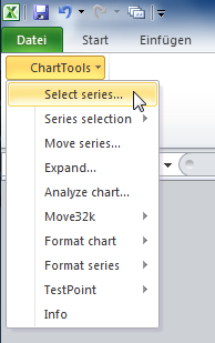
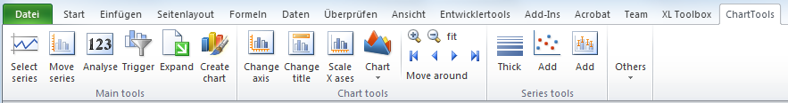
Within Excel 2010 Ribon menu ChartTools is directly accessible via its own Ribbon submenu ChartTools:
Comment: Excel 97-2003 has two different main menu bars (beside many others), the worksheet menu
bar which is visible in workbooks and the chart menu bar which is visible within
charts. Since Excel 2007 the menu structure is completely different, because the
ribbon menus are established. ChartTools can be found at the ribbon menu in
Since Excel 2010 new chart functions are integrated, e.g. increasing or decreasing all text in the chart. Therefore some ChartTools functions are integrated in the Add-Ins ChartTools toolbar menu, but not in the Ribbon ChartTools submenu.
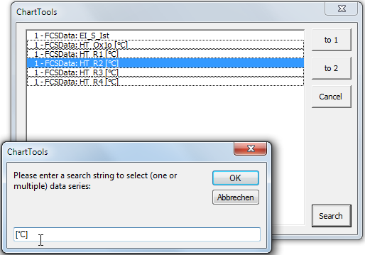
Select series
This dialog box lists all the chart series that are available in the corresponding worksheets (sources) of the active chart. Due to the fact that one chart can show series based on different source worksheets , the name of the worksheet is placed in front of the name of the available series.
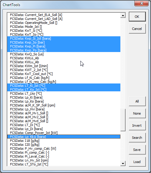
Those series which are already shown in the active chart are preselected in this
list. To add or delete series just select the corresponding list entry. Several buttons assist the selection of series.
Button
Move series
Series may refer either to the primary (left) or to the secondary (right) y (or category) axis in the active chart. This dialog can change this for multiple series in only one step.
The button
The
Expand
If additional data are added to a worksheet, the references of the corresponding series in a chart are not changed accordingly. This procedure checks if there are more data in the worksheet than displayed in the series. If this is the case either all or only the active chart may be updated to the actual size of corresponding worksheets.
If there is more than one chart in the active workbook, this function can be applied also to all available charts.
Analyze chart
This procedure allows analyzing data within a particular x-axis-range (e.g. a
measured date between hours 8 to 9). In the chart an arbitrary object (e.g. a
rectangle) defines the x-value-range. This object needs to be selected before
performing this procedure. On this x-axis-range the present evaluation is
carried out and the result is written in a newly added worksheet named
Restrictions in the current ChartTools version: only the data from one worksheet are analyzed. Which worksheet is analyzed is defined by the first series in the active chart.
Example
The following chart shows some mathematical functions. A rectangle is included to analyze this part of the chart.
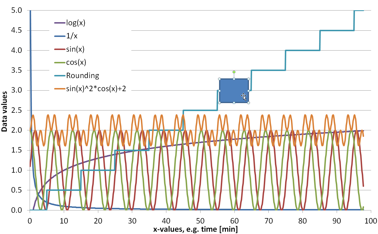
The investigation (analyze) of this chart between the x-axis-range 55.60 and 64.00 gives
the following result in the worksheet
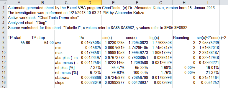
In this sheet
- average
- minimum
- maximum
- absolute plus (=max-ave)
- absolute minus (=ave-min)
- relative plus [%]
- relative minus [%]
- standard deviation
- slope
Move32k
Until Excel 2007 only 32,000 data points can be displayed in a data series. This limit is obsolete since Excel 2010.
This procedure allows moving through the worksheet in the following matter:
- Move to beginning of worksheet (first 32,000 data points)
- Move to end of worksheet (last 32,000 data points)
- Move 32,000 data points forward (to right)
- Move 32,000 data points forward (to left)
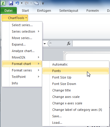
Format chart
Please consider that each of the following procedures can change the format of the active chart and (on request) of all other chart tabs in the active workbook. This is independent if chart tabs are selected or not; (on request) all chart tabs are treated equal. The Excel undo will NOT work with any of these procedures!
Automatic
Reformats the active chart in a common way; this is mostly related to the font (name,
style and size). If there is no chart title available, the name of the current
workbook is used as the chart title. If the chart type differs to the type
Fonts
Format only the font size in a common way.
Font Size Up/Down
Increases or decreases the font size of all fonts in the active chart.
Change title
Change title of all charts in the active workbook. Default is the title of the active chart.
Change axes scale
Change scale of all axes in a dialog box. This was implemented because Excel 2010 redraws the chart immediately after changing any axes format. This max take time!
Change x-axes scale
Change scale of category axis (x-axis) of all charts in the active workbook according to actual x-axes scale of the active chart.
Change label of category axes (X)
Change scale of category axis (x-axis) of all charts in the active workbook based on active chart.
Save...
Save fundamental (not all) format properties of the current chart in an Excel file. This is mainly related to fonts (name, style and size) and axes properties (e.g. scale, etc.).
Load...
Load fundamental (not all) properties from an Excel file and apply it to the active chart.
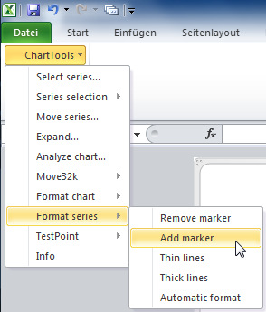
Format series
Please consider each of the following procedures can change the format of the series in the active chart. The Excel undo will NOT work with any of these procedures!
Remove/add marker
Remove or add marker of all series in the active chart.
Thin/thick lines
Set thickness of all series in the active chart to thin/thick.
Automatic
Applies the standard chart type
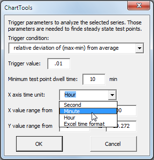
Trigger Test Point (TP)
This procedure triggers or filters the selected series for Test Points (TP). TP are points where (measured) data that belong to the selected series are (relatively) stable. A new worksheet is created containing the result of this procedure. Colored dots are added to the active chart. The yellow dot marks where a stable steady state phase starts; green and red dots mark the start and stop of each TP. See below for more information on this procedure.
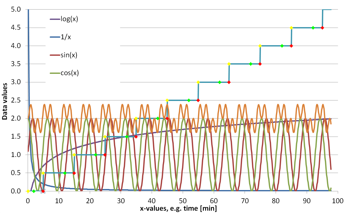
Example
In this example chart the series
The result of trigger TP is a new worksheet
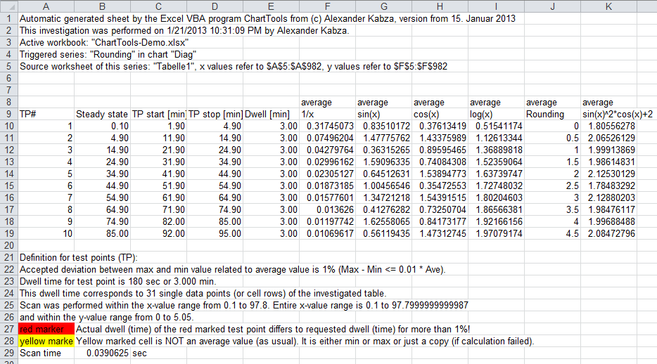
At the beginning the information about the source data is documented. Than the found test points (TP) are listed, here there are 10. The next four columns are:
Steady state start [min] (= yellow dot): The x-value where the steady state criterion startsTP start [min] (= green dot): The x-value where the test point startsTP stop [min] (= red dot): The x-value where the test point endsDwell [min] : The delta between start and stop
Right to those values the triggered TPs for the data series are following. On top of each column the calculation method is shown.
Normally this will be
Below the TPs some more information is given, the values defined in the Trigger Dialog like
ChartTools requirements
It is desired that ChartTools works with all charts, as much as this is possible. But there are some restrictions which are explained here in detail.
Worksheet as source for chart series
Requirements for the worksheets that are sources for series in a chart are described here. Charts that are generated with Excel dialogs are fulfill these requirements automatically. But there are many possible manual changes, which naturally could not be considered individually.
The requirements for a proper operation of ChartTools in detail:
- Series in one chart may have different worksheets as data sources. But: Each data source has to have its own worksheet. Or in other words: More than one data table in a single worksheet do not work!
- The tables that are the data source for series need to stick together. Empty rows and columns are permitted. In particular one empty cell in the column of the x-values defines the end of each table.
- The columns for y-values must stick directly to the right column with x-values. Empty columns are also not allowed between x- and y-values.
- The column headings may consist of more than only one row. For example the units of a measured signal may be written in the cell below the signal name.
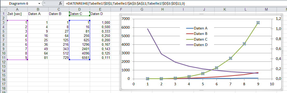
A typical data table as source for series may for example looks as following:
Requirements for the chart
The most important requirement for ChartTools is that a chart exists. This is self-evident due to the fact that the ChartTools menu only exists in the menu bar of a chart, but not of a worksheet. It does not matter whether the chart is an object within a worksheet or its own chart sheet in the active workbook.
A further requirement for the proper function of ChartTools is that the chart type of the
active chart is
As soon as a series is marked (e.g. by a mouse click) Excel allows editing the formula for this series in the formula bar. (Comment: The formula bar is toggled on/off at View>Formula Bar.)
The formula for a series has the following general format. (Comment: Formula names are depending to the installed Office language):
=SERIES(Name;x-values;y-values;Position)
For the example above it is:
=SERIES(Sheet1!$E$1;Sheet1!$A$2:$A$10;Sheet1!$E$2:$E$10;4)
Beside this standard format series can also be defined manually. That makes it almost impossible to handle any customized changes individually. Due to that it is always possible that ChartTools simply does not work at all.
To ensure proper operation of ChartTools I strongly recommend not to change series formulas manually, but to use the automatic generation of charts (and series within the charts) via Excel!
Customized series formula
In this chapter I show some examples for manual changes in series formulas. These examples may be reasonable or not, but ChartTools is not able to handle them! ChartTools performs a consistency check and asks if inconsistent series shall be deleted. You may add the deleted series afterwards with ChartTools, but then hopefully without and inconsistency.
The following inconsistencies are known by ChartTools and checked. And I try to explain why this inconsistency cannot be handled by ChartTools:
- The name of a series is normally a reference to a cell (or range) in a worksheet.
But it can also be fixed string; then the series formula may look like this:
=SERIES("";Sheet1!$A$2:$A$10;Sheet1!$E$2:$E$10;4)
ChartTools is not able to figure out how the other data shall be named, because there is no reference to this name. - The definition for x-values may be deleted manually. The result is:
=SERIES(Sheet1!$B$1;;Sheet1!$B$2:$B$10;4)
In this case ChartTools could not find where the x-values for other data are defined. - The definition for y-values cannot be deleted (Excel does not accept this). But
y-values can be entered manually. The result my be:
=SERIES(Sheet1!$B$1;Sheet1!$A$2:$A$10;{1.2.3.4};4)
In this case ChartTools could not find where the y-values for other data are defined. - Manually it is possible to define series where the x-values refer to rows and the
y-values refer to columns. This may look like:
=SERIES(Sheet1!$B$1;Sheet1!$A$2:$A$10;Sheet1!$B$2:$E$2;4)
But this makes no sense at all for ChartTools! - If the cell count for x-values is not the same like for y-values, it may look like:
=SERIES(Sheet1!$B$1;Sheet1!$A$2:$A$10;Sheet1!$B$2:$B$11;4)
This inconsistency needs to be corrected manually by the user. - Reference may refer to different worksheets. Like this:
=SERIES(Sheet1!$B$1;Sheet1!$A$2:$A$10;Sheet2!$B$2:$B$10;4)
This also makes no sense for ChartTools! - References need to be one cell or a vector (cells in a row or cells in a column). The
reference shall not be an array like this example:
=SERIES(Sheet1!$B$1;Sheet1!$A$2:$A$10;Sheet2!$B$2:$C$10;4) - The name of the series may refer to a different column like the y-values. Example:
=SERIES(Sheet1!$B$1;Sheet1!$A$2:$A$10;Sheet2!$C$2:$C$10;4)
The name of a series shall be in the same column like the y-values.
The following feature works:
The reference to the name of the series may have more than only one cell, for instance more
cells in the same column like this:
=SERIES(Sheet1!$B$1:$B$4;Sheet1!$A$5:$A$10;Sheet1!$B$5:$B$10;4)
If this is the case, than hopefully for all series referring to this worksheet.
Corrupt series
Corrupt series (like explained here) are maybe the most severe issue with respect to series inside a chart; and it is maybe also most difficult to deal with corrupt series in VBA programs. Corrupt series can not be handled with VBA programs and therefore it is e.g. impossible to delete this series by VBA programs. These corrupt series are not visible in a chart, and they can not be selected by mouse or keyboard. This means that for Excel (without VBA) those corrupt series doesn't exist. But: They exist; and they cause severe trouble as soon as a VBA program wants to work with it!
To proof the existence of corrupt series in chart can be shown by the following two VBA codes (both examples are doing the same, including the same result):
For Each S In ActiveChart.SeriesCollection
Debug.Print S.Formula
Next S
Alternative code:
For I = 1 To ActiveChart.SeriesCollection.Count
Debug.Print ActiveChart.SeriesCollection(I).Formula
Next I
Both examples terminate with a runtime failure as soon as the VBA program wants to handle a corrupt series; the error code is 1004. Currently, I know only one example how such kind of corrupt series can occur: When a series is referring to either a complete empty x-value and/or y-value range! It's funny that also an automatically (by Excel) generated XY scatter chart contains this corrupt series if e.g. y-values are empty in one column.
As said above this corrupt series can not be deleted by VBA programs (because also ActiveChart.SeriesCollection(I).Delete results in a runtime failure)! Those series can only be deleted manually (via Excel dialogs). To delete the corrupt series you first need to figure out which series is corrupt. The best way to do this is to select and delete all series in the corresponding chart. Finally the last existing but not visible (!) series is the corrupt one.
To delete corrupt series via Excel dialog:
- Open source data dialog via Chart>Source Data
- Click to the Series tab
- Select the corresponding series and
- Click the remove button.
How Trigger Test Points works
The procedure
A dwell time needs to be defined, e.g. five minutes. Within this desired dwell time the average, minimum and maximum values of the filtered data are calculated. The criteria stable is fulfilled as soon as both the minimum and the maximum value are within an accepted percentage deviation of the average value:
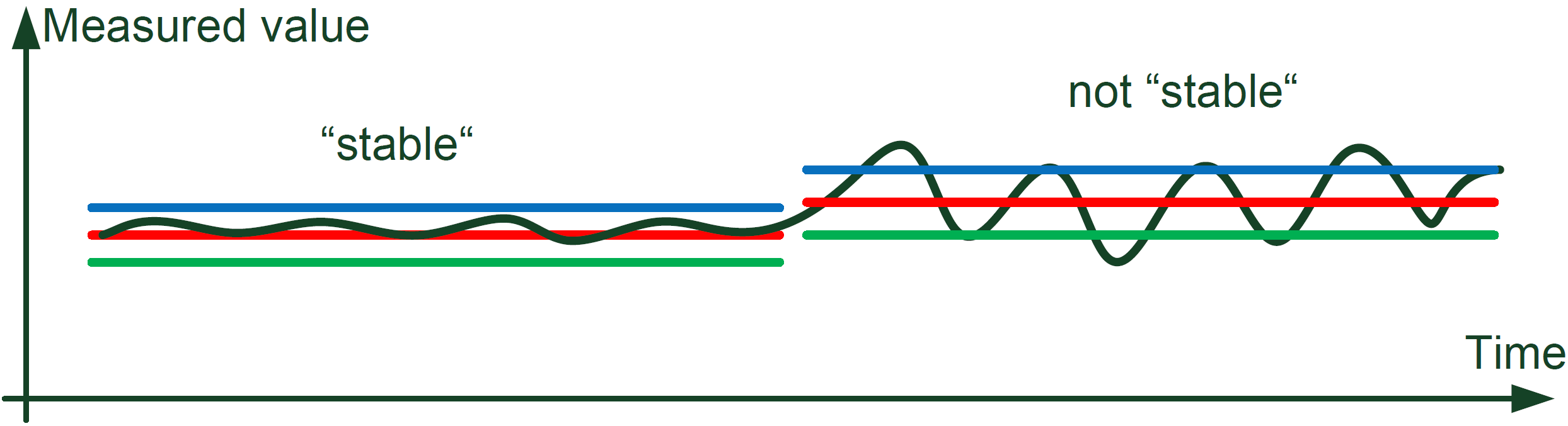
The investigate data are now filtered for stable phases;
this is done by passing through the corresponding data. Once the stability criterion is met, a marker
called
The following chart explains this. The stable phase #1 is obviously longer than the desired dwell time t. The stable phase #2 fits precisely into the desired dwell time t. Both are defining one test point each. The stable phase #3 is shorter than the desired dwell time t; therefore there is no third test point in this example.
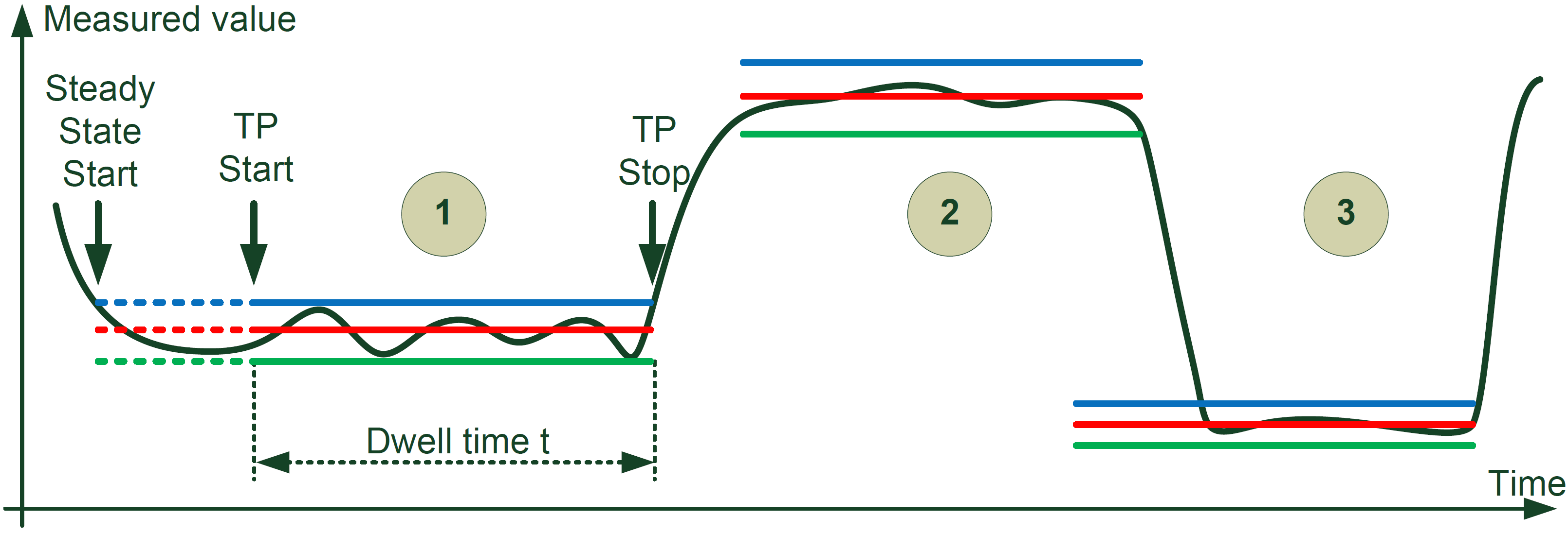
In this manner all test points at the end of a stable phase will be found. Each
detected test point will be recorded in a new worksheet
Restrictions of the Trigger algorithm in the current version of ChartTools
- This filter works (currently and flawlessly) only with a constant sampling rate! This restriction is due to the speed of the filter algorithm.
- Only the source data from one worksheet are evaluated. Which source data are evaluated is defined by the filtered (selected) series.
- The filter algorithm gets in trouble finding stable criteria in strong oscillating source data.
Known problems and further questions
In the moment no problems are known. Please give me your feedback if you find any problem that does not allow working with ChartTools in your Excel chart.
However, I am open for all ideas and suggestions to improve ChartTools. Especially I am interested if ChartTools does not work properly with your Excel charts. Most challenging in programming is to handle all exceptions; and to take care of all of them.
During programming of ChartTools I learned that it is nearly not possible to deal with all individualities. Here, I rely on users feedback. Please supply if possible also the Excel file where ChartTools struggles with.
ChartTools installation
Copy the Excel-Addin ChartTools.xlam in the XLSTART directory of the current user to install ChartTools
on your computer. For Windows XP the XLSTART directory is located here:
C:\Dokumente und Einstellungen\username\Anwendungsdaten\Microsoft\Excel\XLStart
And for Windows 7: C:\Users\username\AppData\Roaming\Microsoft\Excel\XLSTART
All files that are located within this XLSTART directory are opened automatically with each Excel startup. Also the ChartTools menu (for version before Excel 2007) will be installed automatically, if it does not exist already. For Excel 2007 and Excel 2010, ChartTools.xlam itself contains the Ribbon bar (in customUI14.xml inside the zipped Excel file).